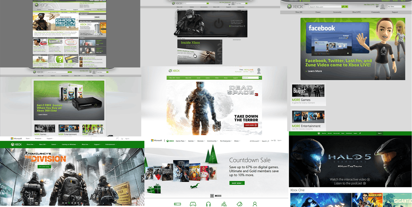
Xbox is one of the major gaming companies in the world. Created and owned by Microsoft, it was launched in 2001, and since then, it has become a global brand. In this review, we will discuss the evolution of the Xbox website and see how the design elements improved over the years.
2003
In 2003, the website was not very well organized. Honestly, it was cluttered, and lots of space was not being utilized at all.

However, the navigation of the website was pretty good. It also had a sign-in button and a search bar. The color scheme, however, was pathetic. Grey and green did not go well at all.
2004
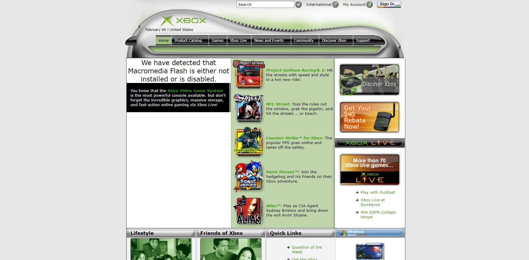
In 2004, the website stayed pretty much the same. The only changes were the new games and ads.
2005
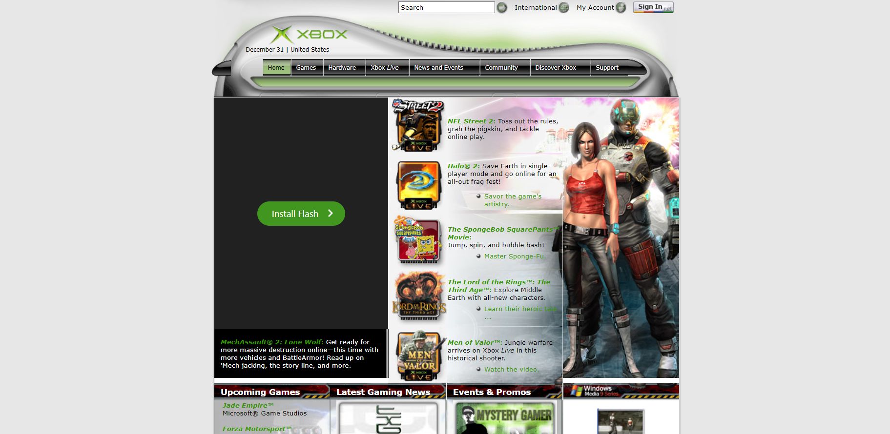
In 2005, the design looked much better due to the addition of backgrounds that featured the latest games and characters. The homepage also featured a list of upcoming games.
2006
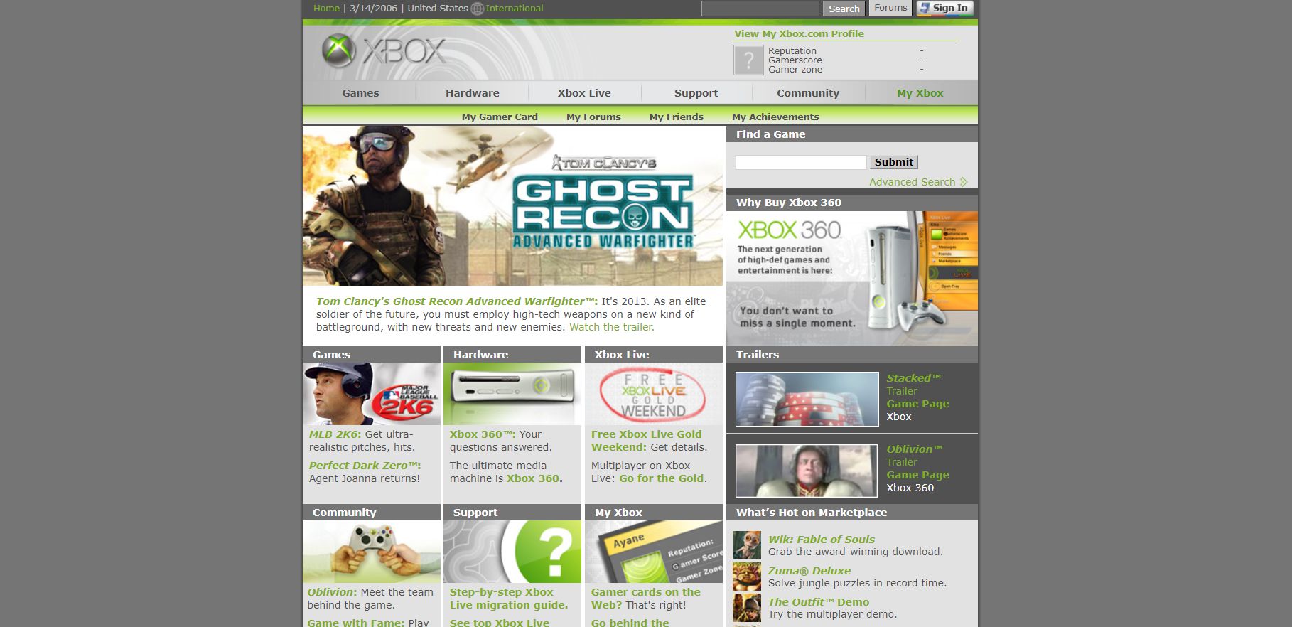
In 2006, the website was changed completely. It featured the new Xbox logo and design schema. The navigation was pretty much the same; however, some buttons were switched. Xbox also personalized the experience for the user by posting ratings on the homepage.
2008

2008 brought a significant change in the design elements of the website. The website became less information-centric and more minimalistic. The navigation, however, remained similar. The colors became uniform, and the new, a bit darker, shade of grey looked more appealing.
2009
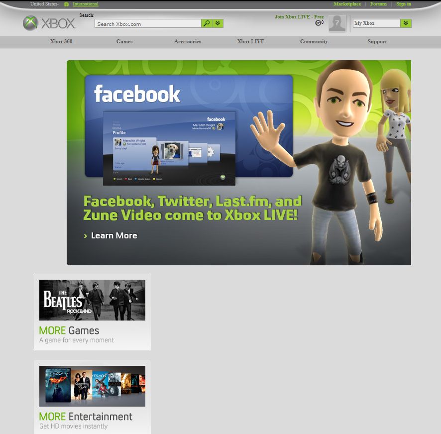
In 2009, Xbox tried to utilize more space on the home page, but honestly, the proportion of elements wasn't great. The navigation and color scheme stayed the same.
2010
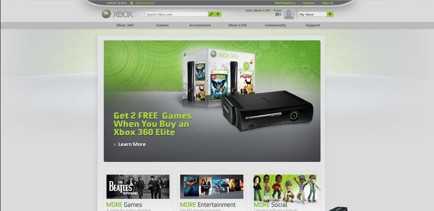
In 2010, Xbox also tried to play around with the background to complete the aesthetics; however, it was not a perfect effort. The navigation panel and buttons were the same.
2011
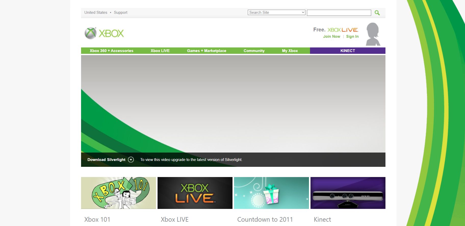
2011 was a much better design year for Xbox. The layout was much better and uniform. Xbox also featured avatars on the top right corner of the screen. White, a brand-new color, was added to the theme, which improved the overall aesthetics and the logo as well.
The best thing was the navigation panel. It featured a neat and clean look, which honestly improved the general sense of the homepage.
2012
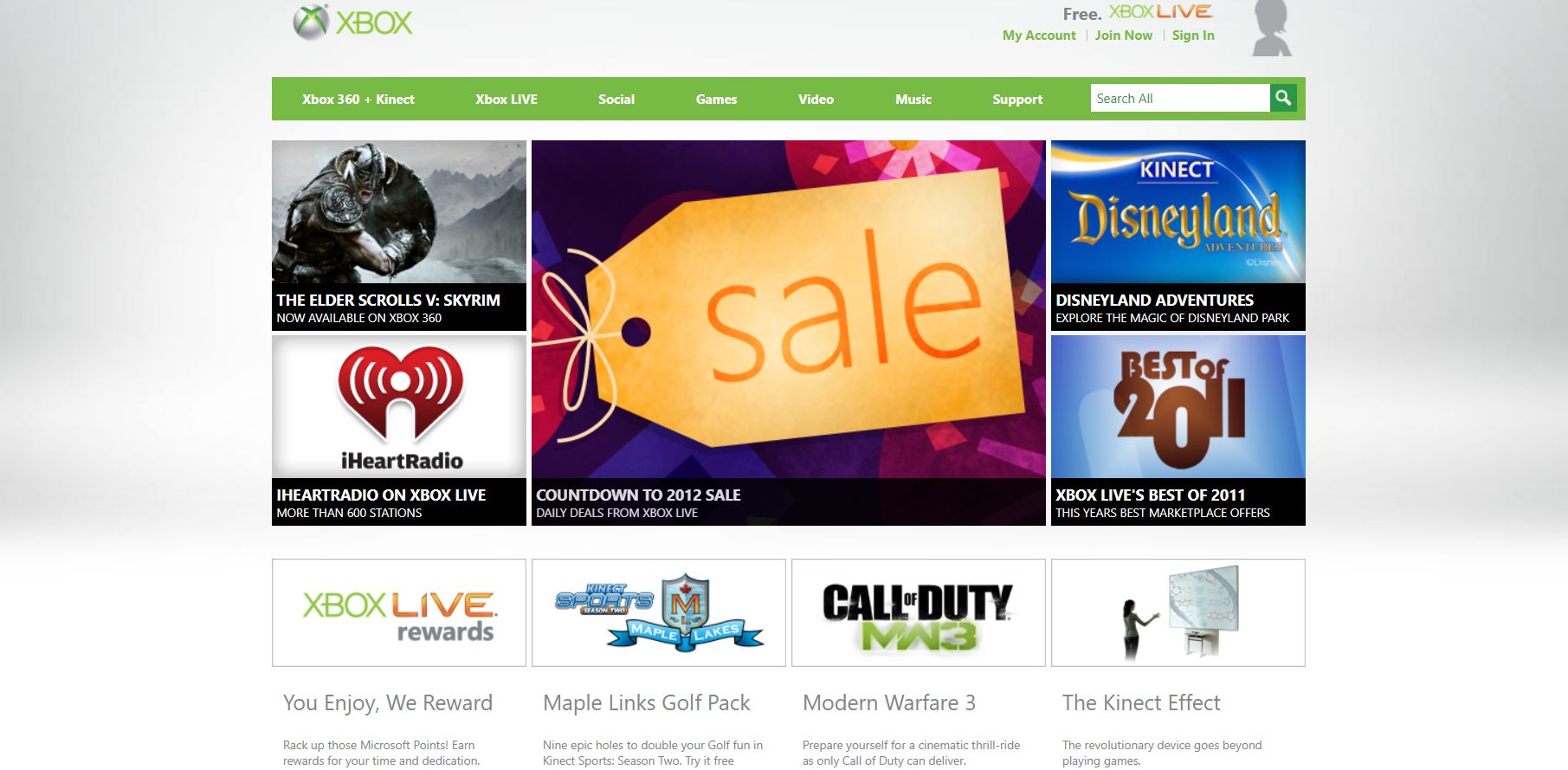
2012 started featuring more elements. It had a neat and uniform layout. Also, the focus on information was eminent in the design as well. Other details were almost like the previous version.
2013
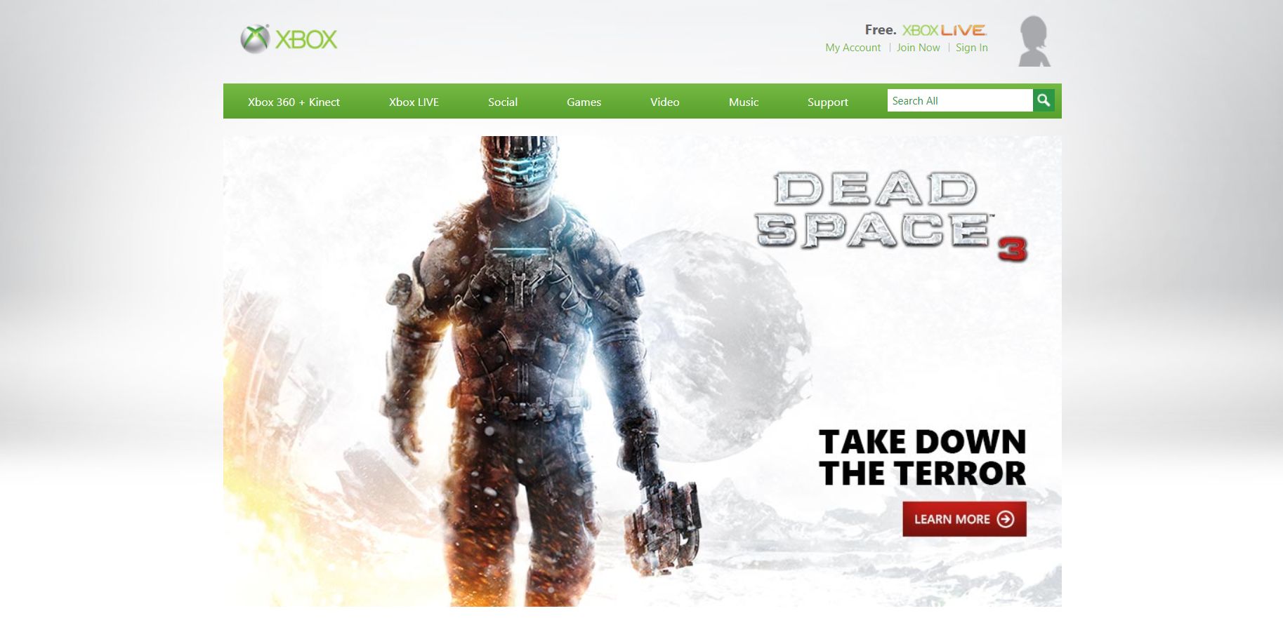
2013 featured a significant change. The home page got rid of all the extra elements. It showcased a slide show of upcoming games which improved the overall design as well. Other elements remained the same.
2014
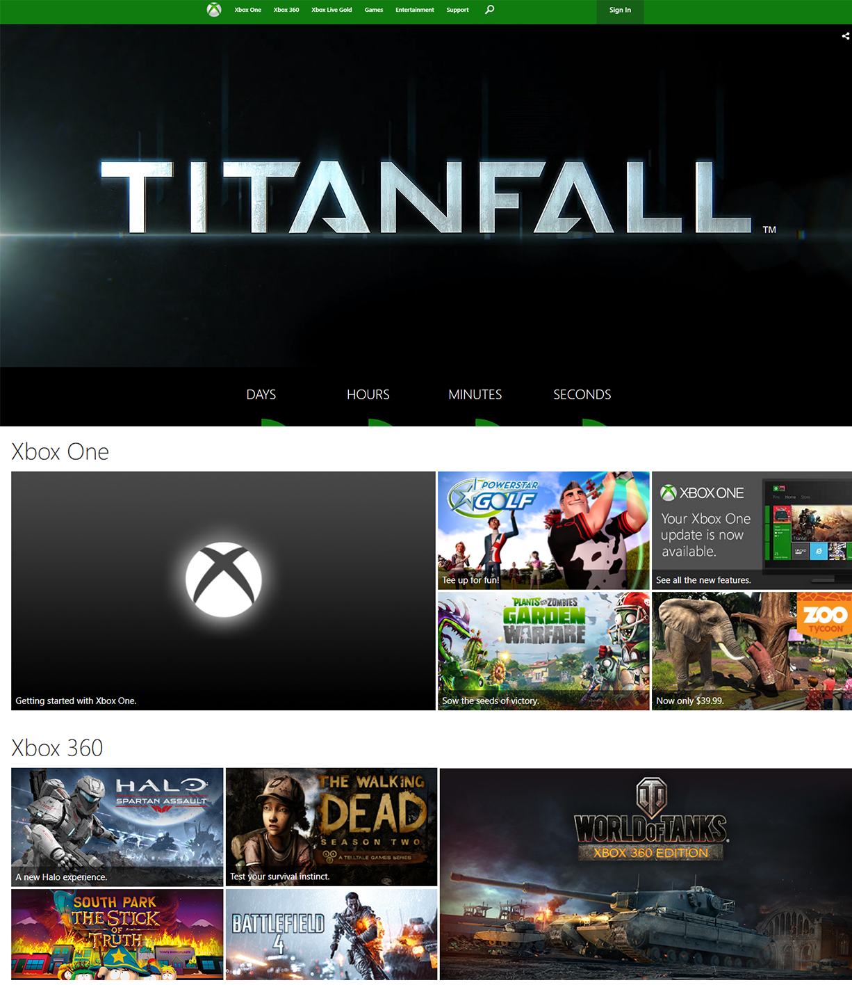
2014 was the year when Xbox began to utilize space very well. The design was a mix of 2011,2012 and 2013. Xbox also featured darker colors for the overall theme. The website likewise had a more optimized navigation panel, which also improved the overall look.
2015
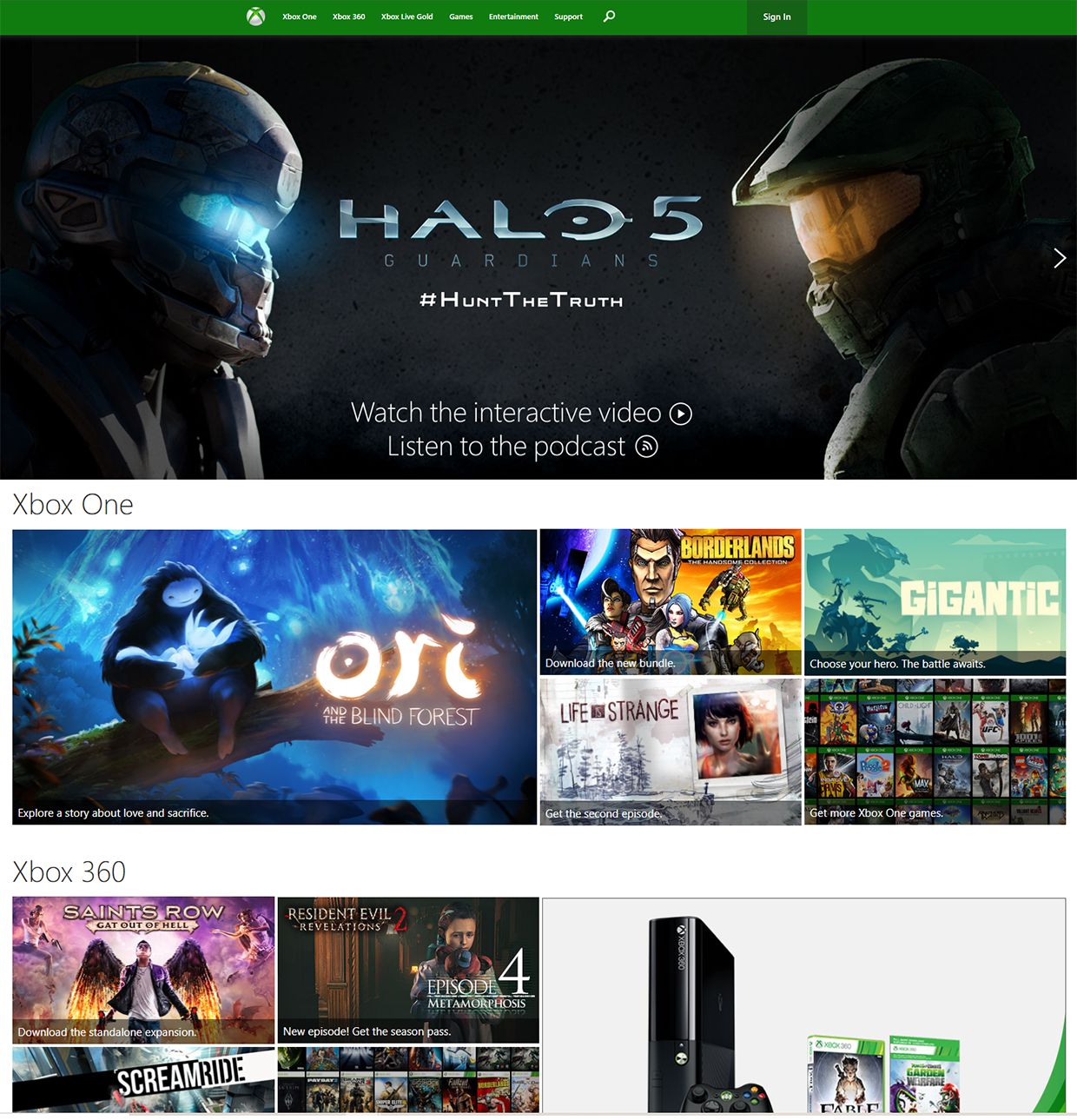
In 2015, Xbox did not change any design element, and the website remained almost the same as 2014.
2016
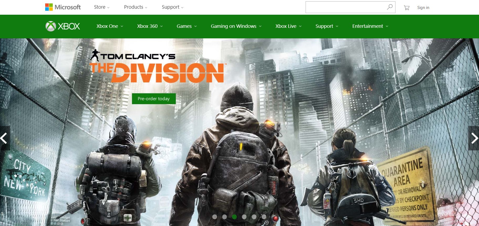
In 2016, Microsoft made things more accessible by introducing 365. The website, like all other Microsoft websites, featured the company’s branding.
The navigation panel had more buttons, and the slide show element was the major highlight of the webpage. Although the design was much better, the separate green and white branding for Xbox and Microsoft did hurt the overall uniformity.
2017
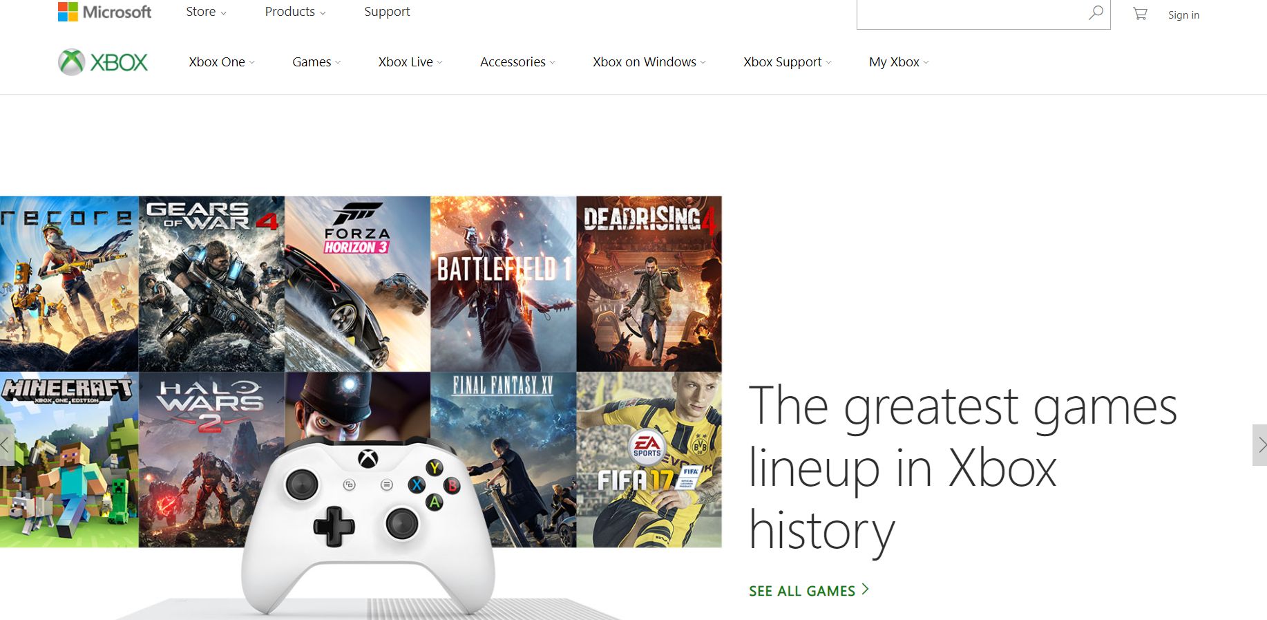
In 2017, the design became more uniform with the introduction of white instead of green but separate elements for Microsoft still ruined the overall uniformity of the website.
2018
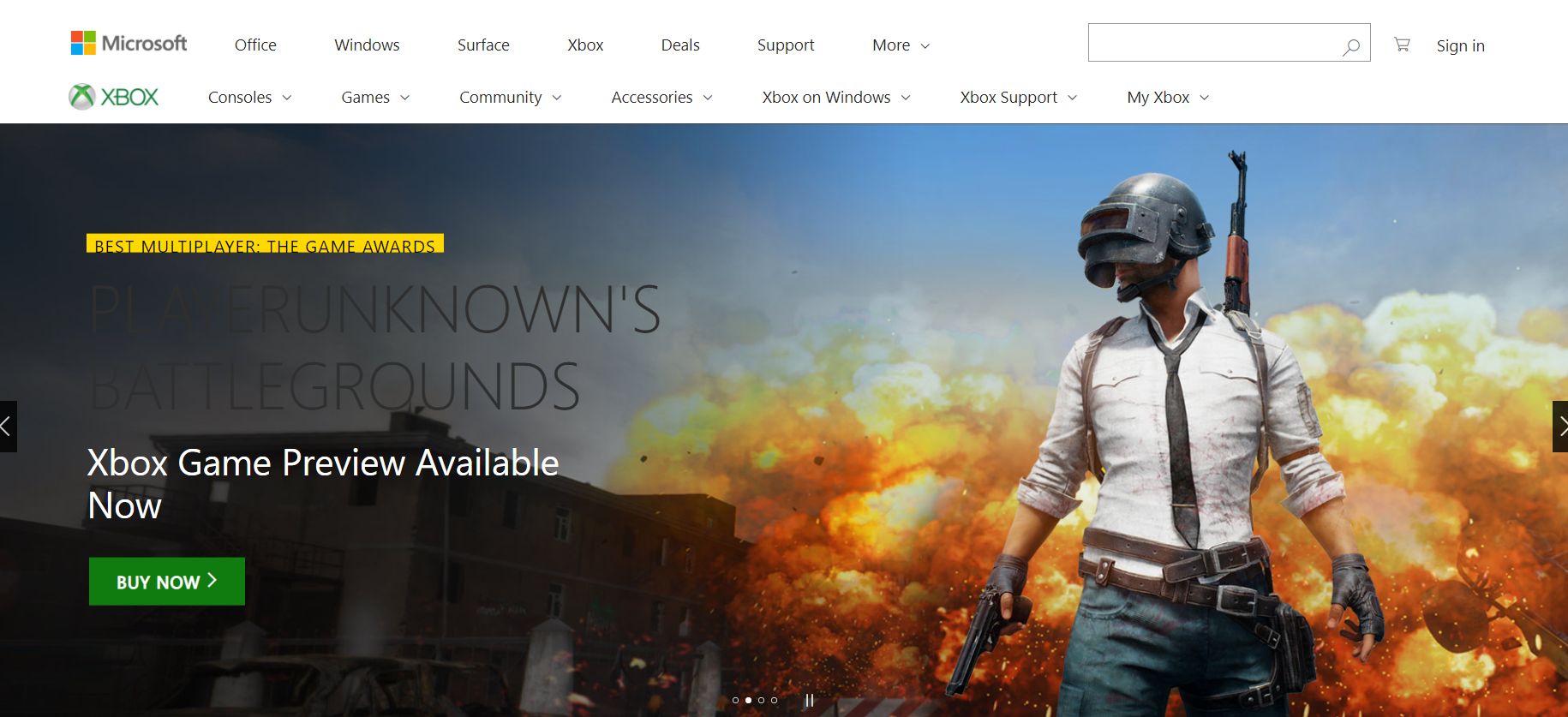
2018 was almost the same as the previous year; however, a few more buttons and dropdowns were added to the navigation panel.
2019
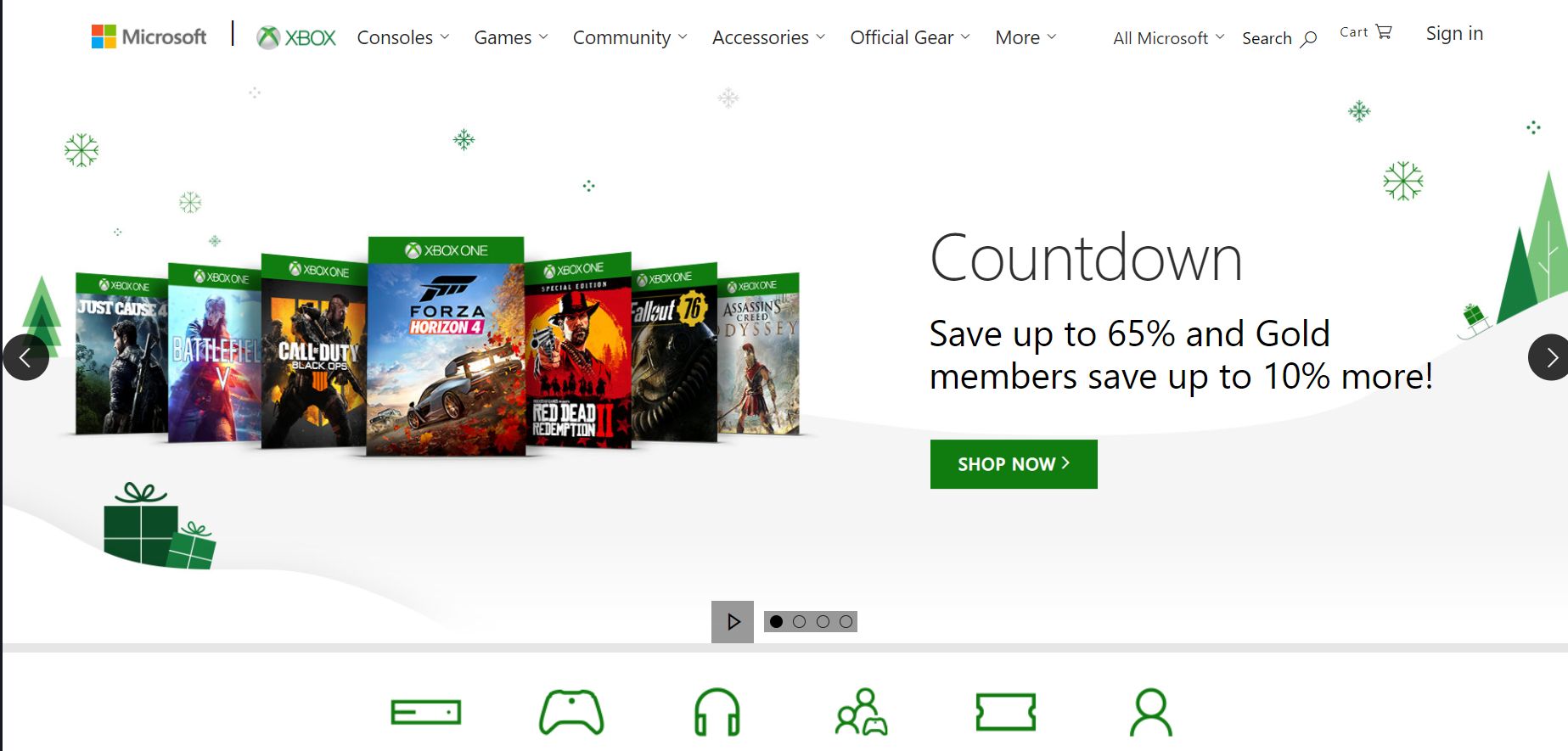
In 2019, Xbox finally realized the problem of two separate navigation panels and merged both. The overall design looked much more uniform. Also, the introduction of vector elements improved aesthetics.
2020
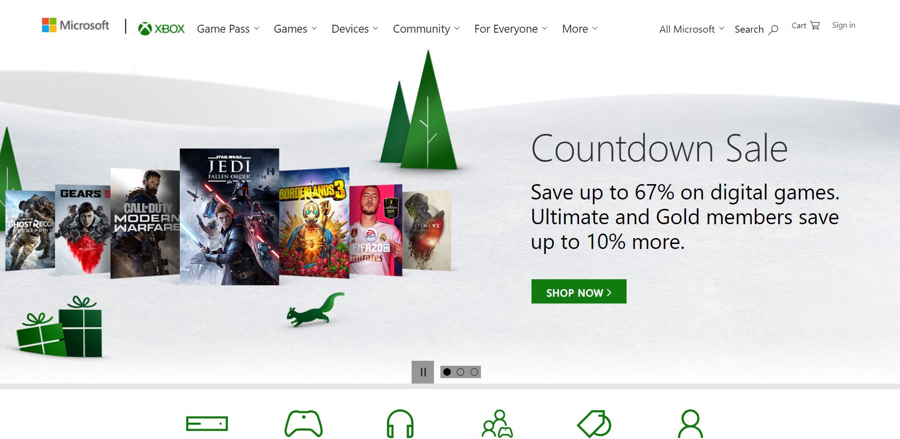
No changes were made in 2020.

