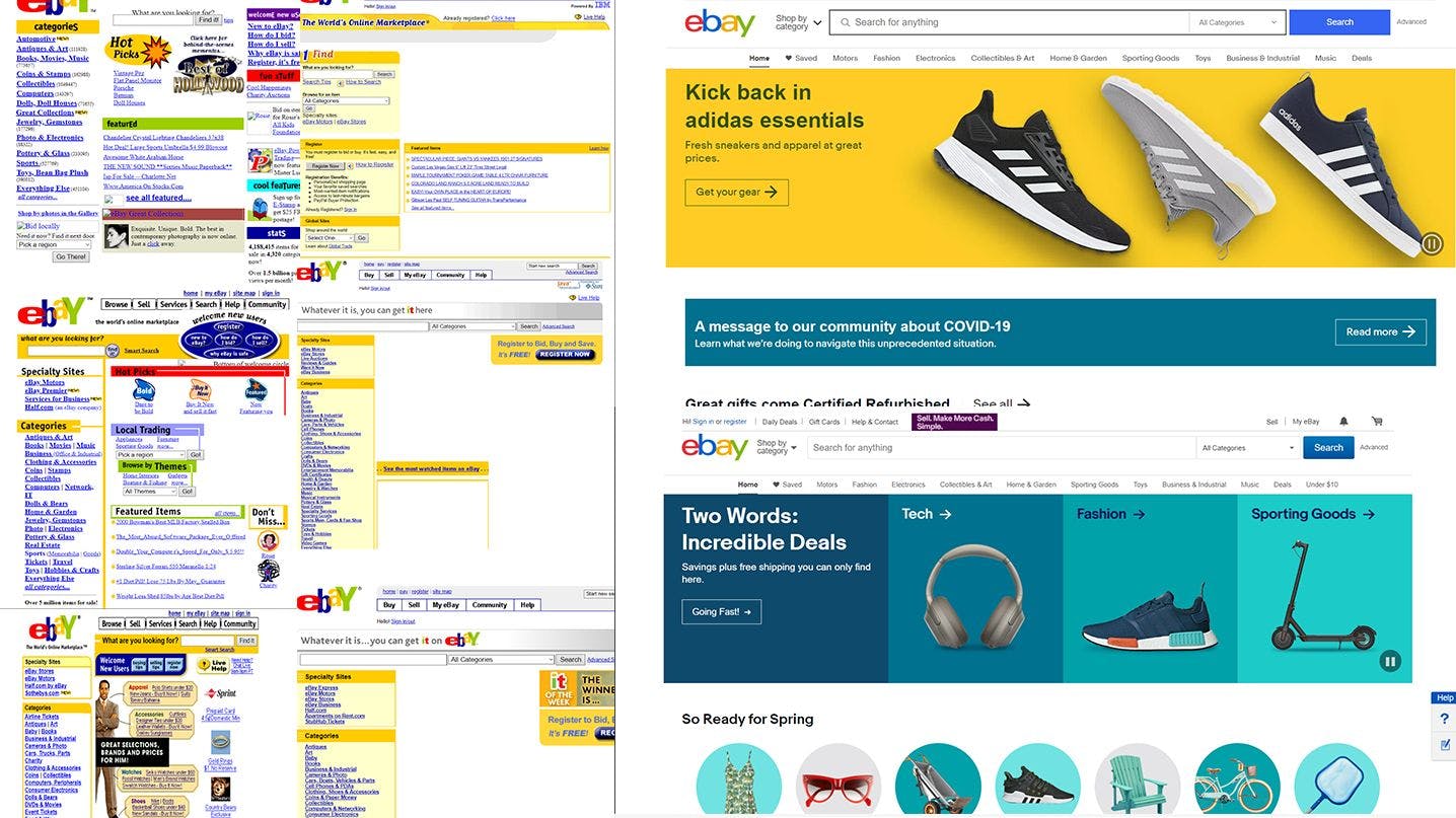
eBay is a multinational e-commerce platform. It facilitates consumer to consumer and business to consumer sales through its website. eBay was founded in 1995 by Pierre Omidyar.
It has operations in more than 23 countries. It is a free-to-use platform for buyers, but sellers pay a fee after a limited number of free listings. Today we will review the changes to the eBay homepage in the past 21 years and see how the website evolved over time.
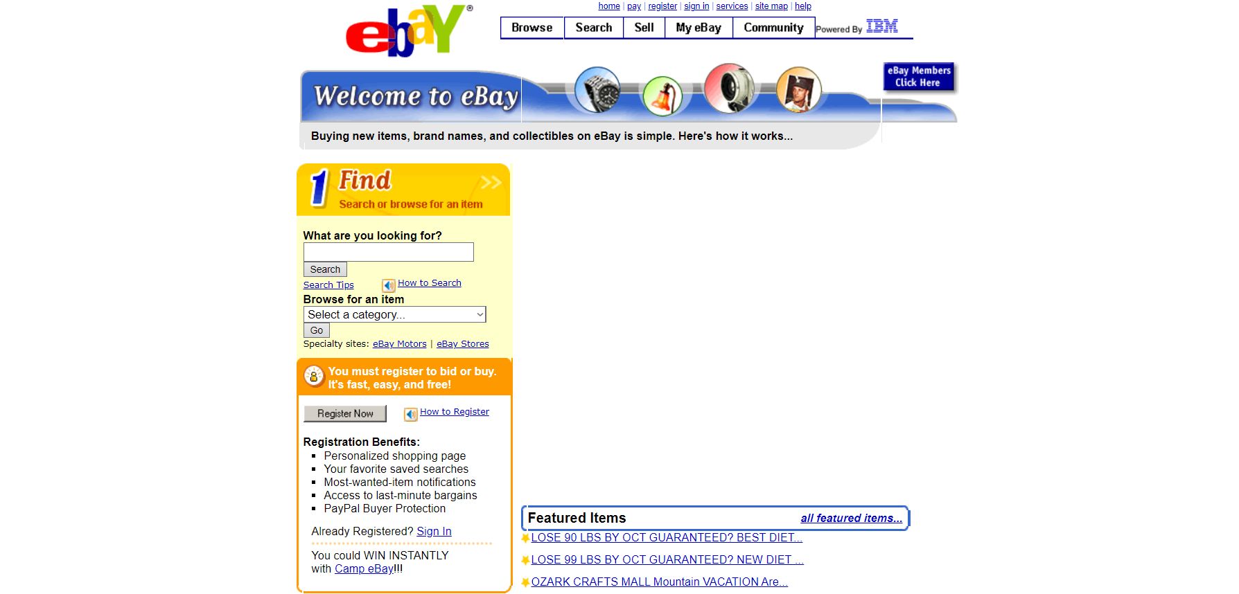
2000
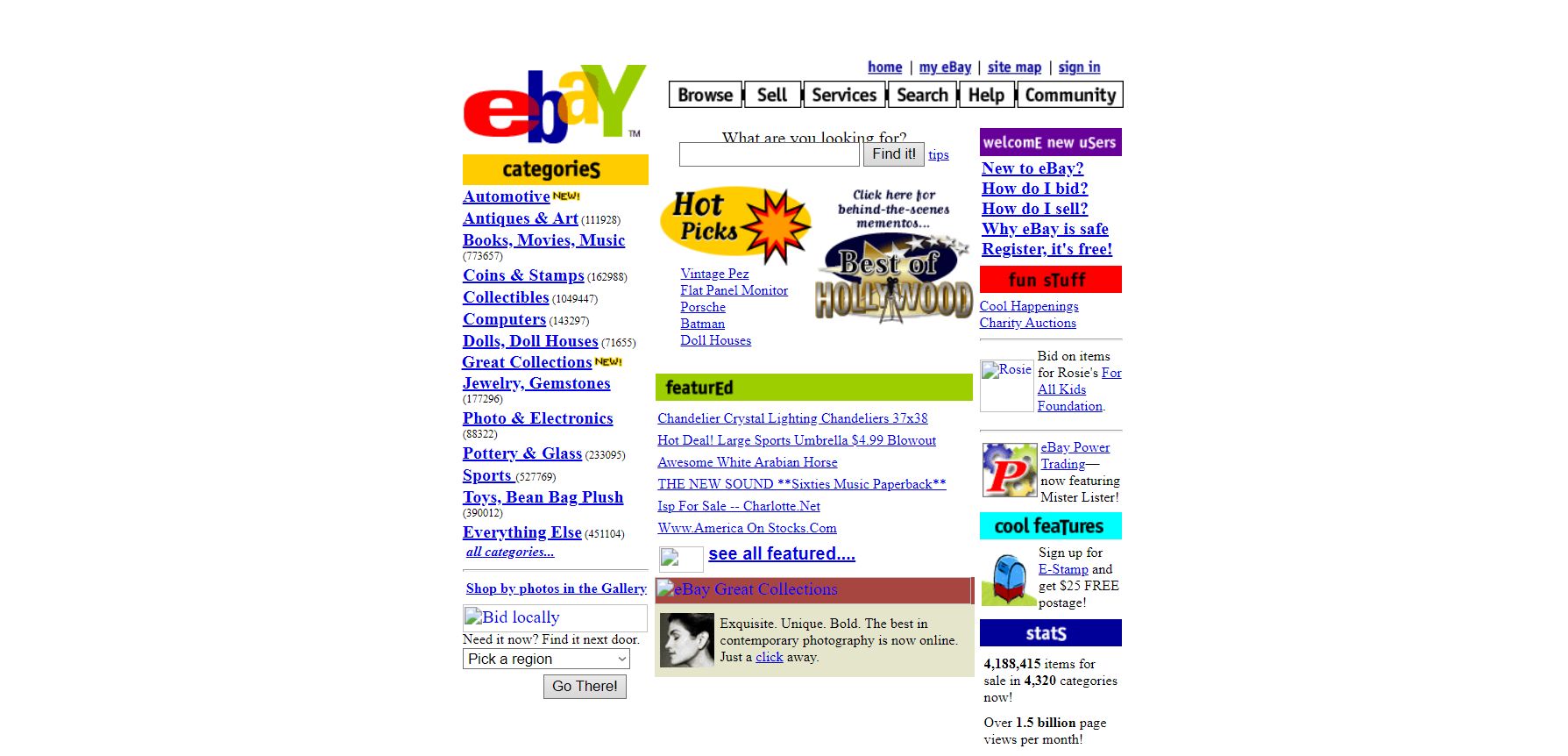
In 2000, the website was not very well organized. Honestly, it was cluttered. The web design heavily relied on buttons.
The website was colorful but the overall schema was not pleasing to the eyes.
2001
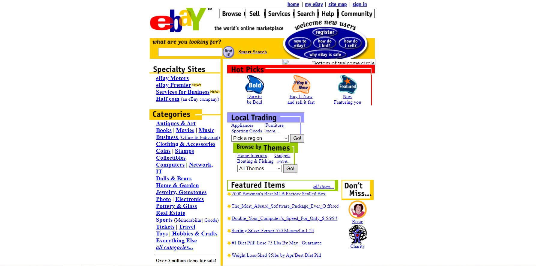
In 2001, the website stayed pretty much the same. A few changes included a visual division of the page and a refined search bar.
2002

In 2002, the design looked much better due to the clear divisions and columns on the page. However, the design still had too much information.
2003
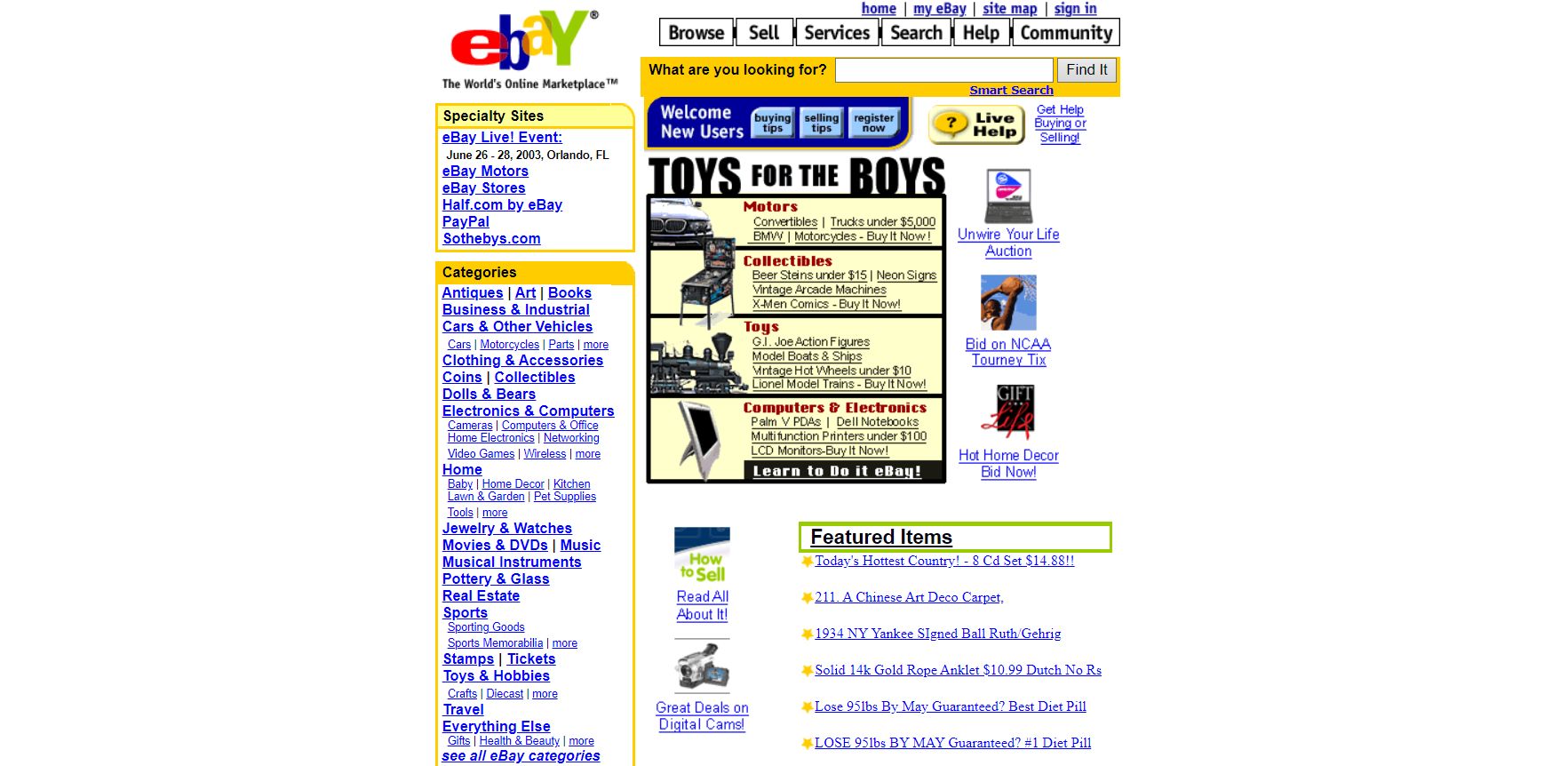
In 2003, the overall design remained the same.
2004
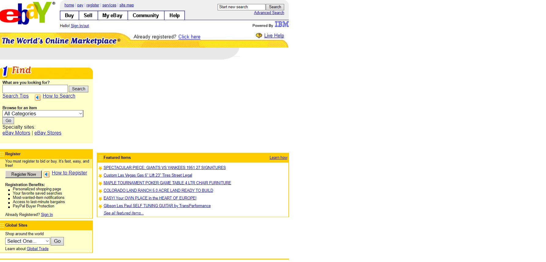
2004 was a significant change in the design elements of the website. The website removed the list of category-wise buttons and introduced a refined search.
2005
In 2005, the design remained the same but the color scheme majorly involved shades of yellow.
2006
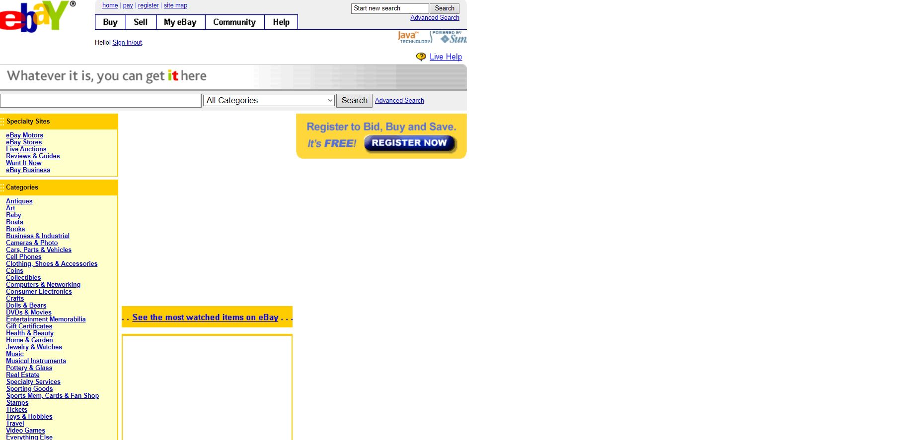
In 2006, the space of the search bar decreased and again category-wise buttons were introduced on the homepage.
2007
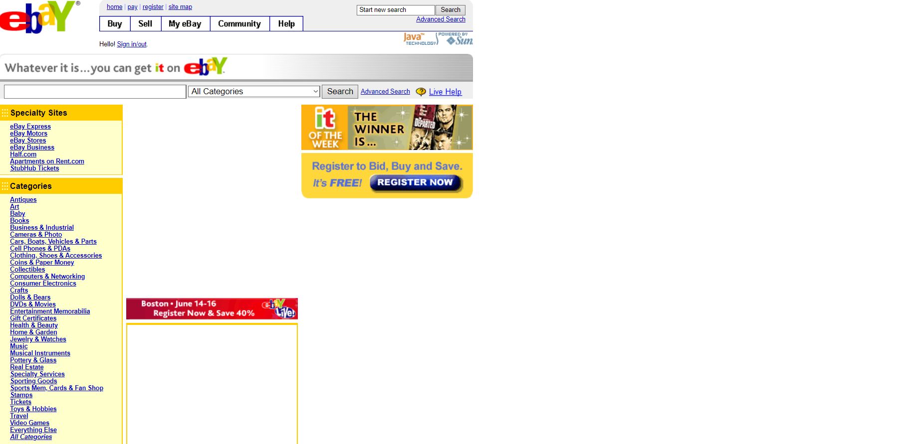
In 2007, the design remained the same.
2008

In 2008, the overall design sense remained the same, however, it became more pleasing to the eyes. eBay focused more on increasing the member base which is reflected in the design as well.
Also, the website started featuring fewer images but made them more prominent.
2009
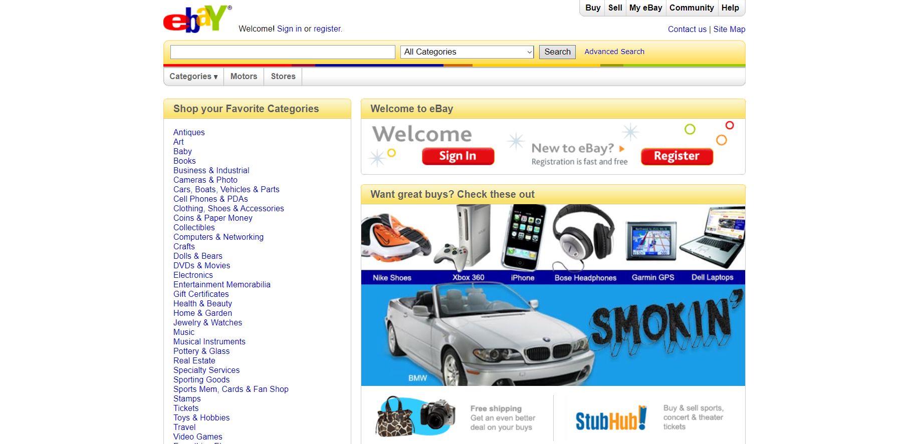
In 2009, the design did not change.
2010
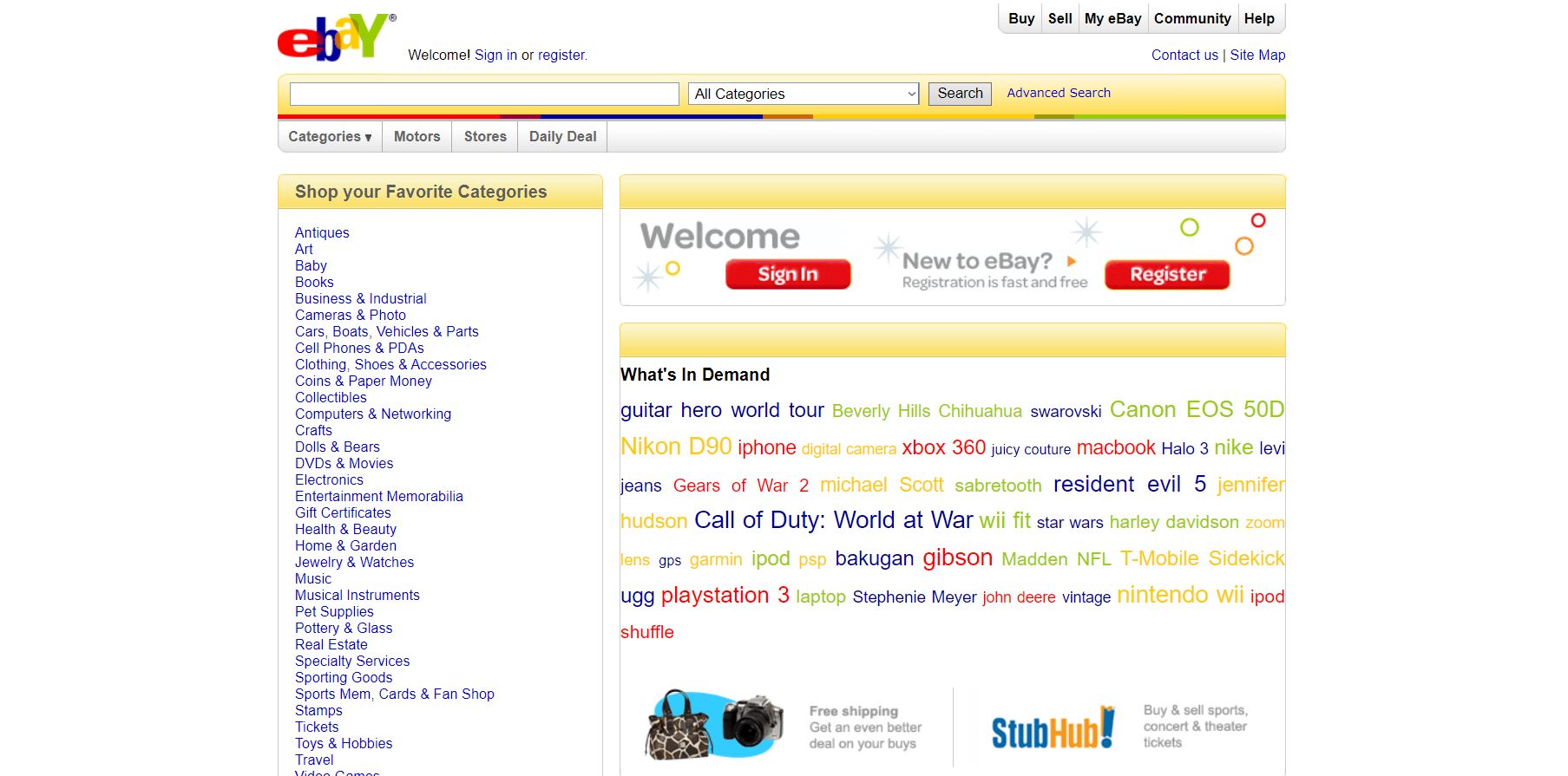
In 2010, the design remained the same, however, eBay tried colorful texts instead of images to feature products. Honesty, it did not look good.
2011
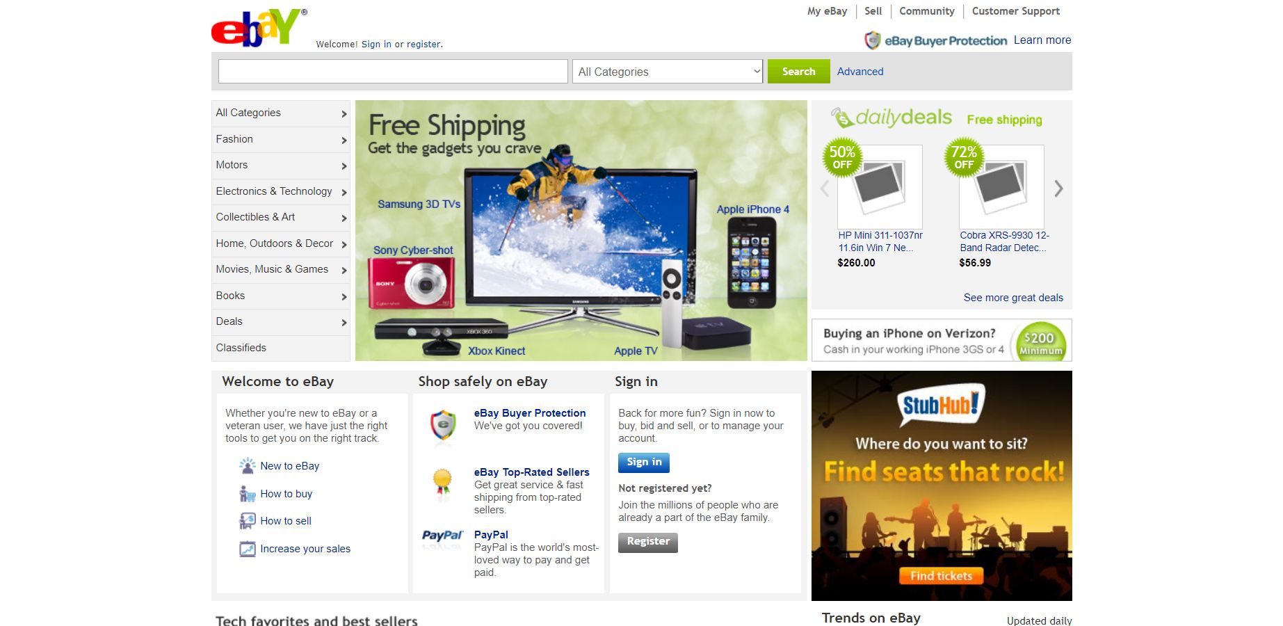
In 2011, eBay made major changes to the structure of the design. It introduced a compact version of the category list, which provided more space for a welcome, security guidance, and sign-in. The overall color scheme also changed to a grey tone.
2012
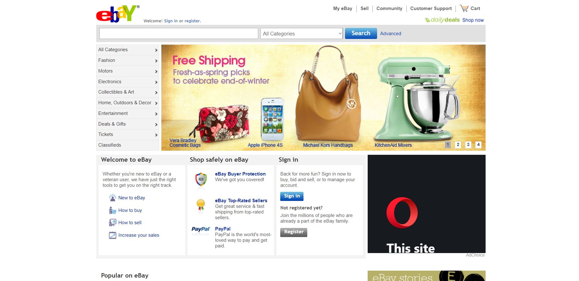
In 2012, no major changes were made except a few colors here and there.
2013
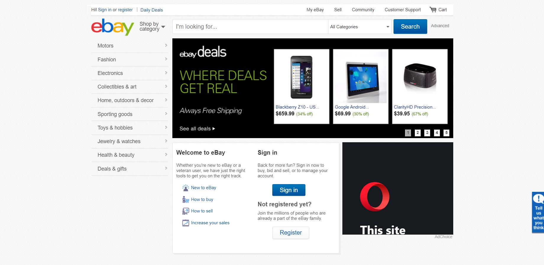
In 2013, eBay continued on creating a more refined design and optimized the community navigation bar.
2014
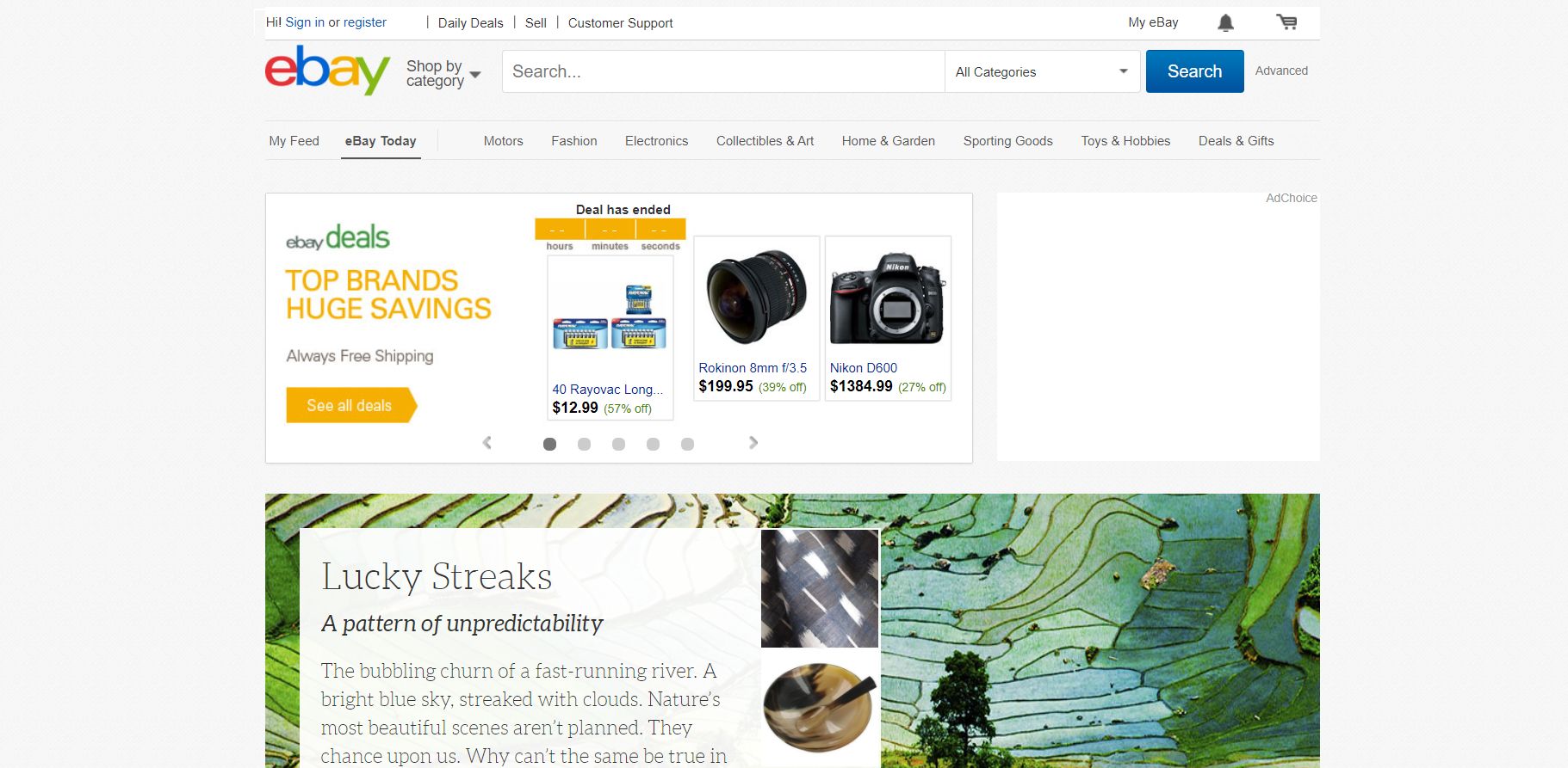
In 2014, eBay optimized the category navigation panel and moved it to the top of the page. It also optimized buttons on other navigation panels. The rest of the design remained the same.
2015

In 2015, the design was optimized to follow consumer behavior, however, the overall theme and design remained the same.
2016
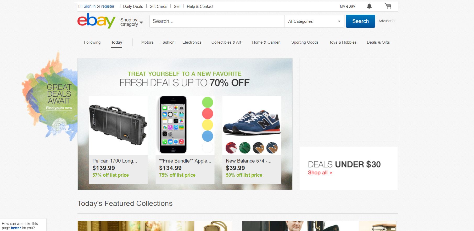
In 2016, the design remained the same, however, eBay played around with aesthetic elements to make it visually pleasing.
2017
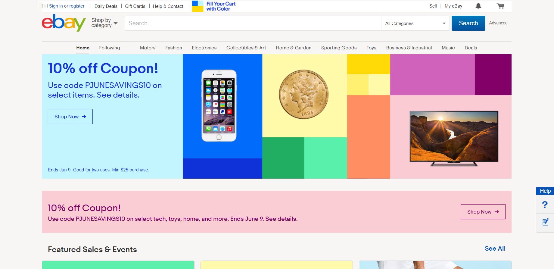
In 2017, eBay optimized the navigation panels. The overall design remained the same. However, eBay did start using images as banners and slideshows.
2018
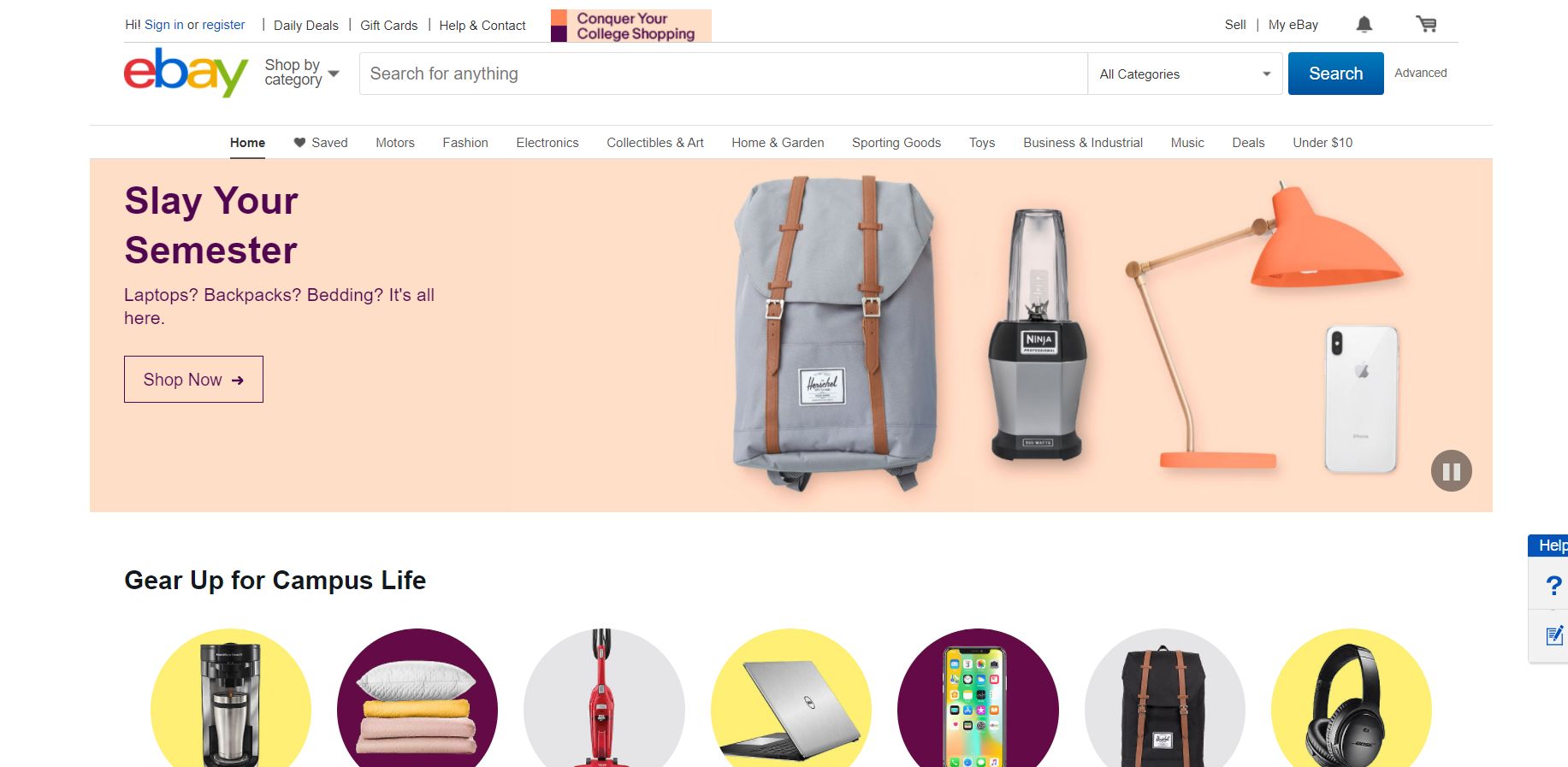
In 2018, the design remained the same, however, eBay kept changing elements according to consumer trends.
2019
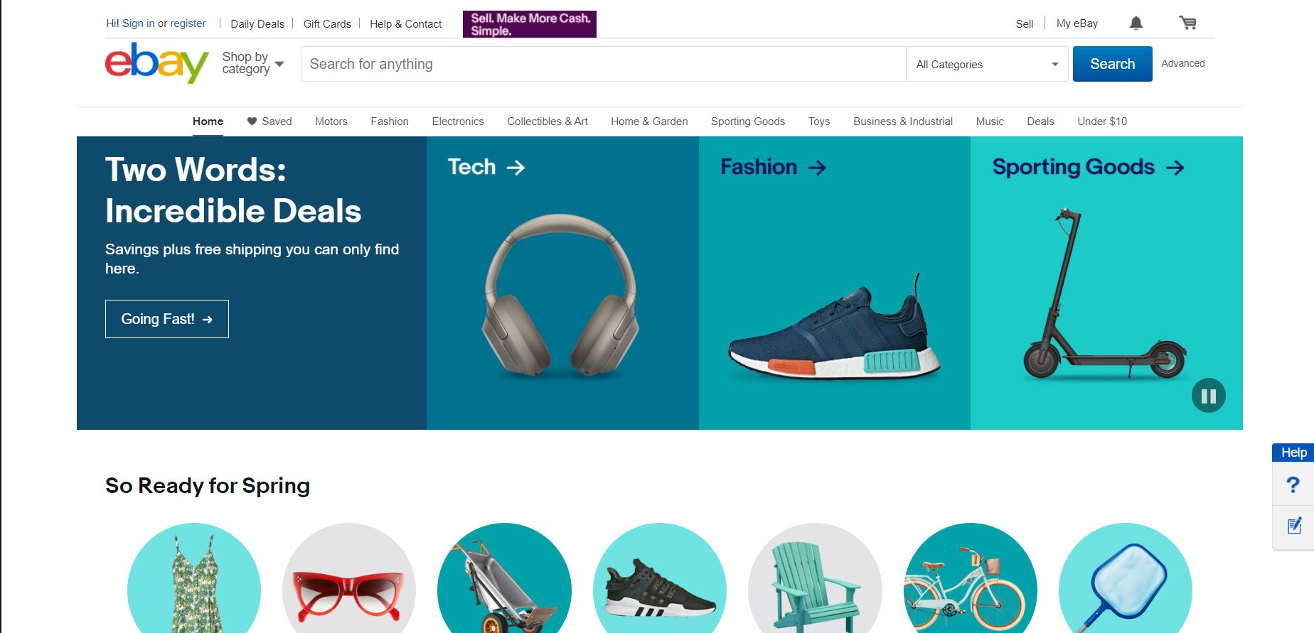
No changes were made in 2019.
2020
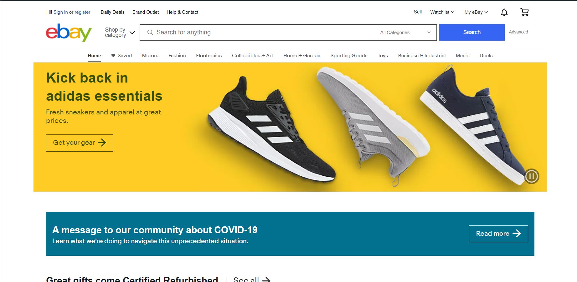
No changes were made in 2020.

